Unit 21: Make a Business Card, Poster or Flyer for your Employer/Client
This project will cover sub-elements 1.1 to 4.1 in Unit 21 in which I will be designing a business card, poster or flyer for my employer/client by using appropriate subject terminology.
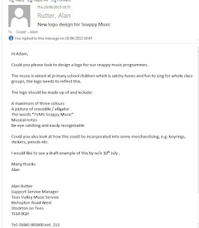
My employer, Alan Rutter, gave me the task of designing a brand new logo which would be used as a way for branding the company to primary schools. Below is a copy of the brief I was given:
 |
| Email 1: Unit brief from Alan. |
As you can see Alan has given me a specific project that I need to complete by the given time frame (10th July) accompanied by a set amount of requirements that need to be fulfilled.
Using Microsoft Publisher, I experimented with the colour scheme and the design layout. I didn't want the logo to be cluttered; through research I have found that some of the most popular and recognisable companies in the world are simple but unique. A great example of this is Apple.Inc. Using the simple yet stylish apple shaped logo to brand their image and products made them household names. The colour scheme however, was not as straight forward. The brief stated that I had to make my logo up of a maximum of 3 colours . My initial designs represented the three colour rule but later on in my design work I incorporated more colours which, to be honest was the right decision as I gave the logo an identity. The Tees Valley Music Service logo is purple, green, orange, blue and pink so I wanted my colour scheme to match the logo.
 |
| TVMS logo colour scheme is eye catching. |
I began by opening a new Publisher document. I then copied the logo above and pasted it onto the blank A3 document.
Next, I again uploaded an image to publisher; this one representing a cartoon crocodile which would be the main focus of the logo and was also a requirement as stated in the brief I was given. Using the automatic measurements which appeared when I dragged the image, I was able to line the TVMS logo with the crocodile image.
After that I used the "WordArt" tool to design the font style (I went with Arial Black). I then changed the colour to green (resemblance of a crocodile) and the font size to 36. When I was happy with the text I placed it under the crocodile. This was because I wanted the logo to look compact and organised.


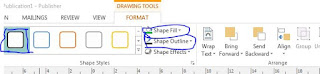
Using "WordArt" again I constructed each letter of the word "music" separately and changed the colours using Shape Fill and Shape Outline. It was tricky to get the size of the text the same as I was doing each letter separately. To finish off my logo I needed musical notes. I copied and pasted copyright free pictures onto my logo design, moving and rotating them until I was satisfied with my finished design. Finally I grouped all the images and text together so that the whole logo was one picture.
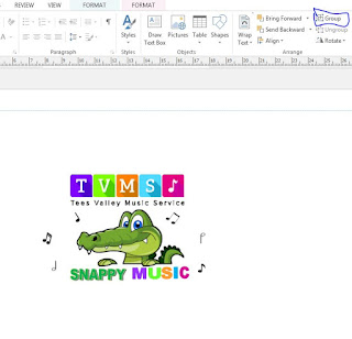 |
After I grouped all the elements together using the grouping tool located above, it
became one single image which I could move with ease. |
I decided to save my logo as a PDF and a JPG. The reason for converting my document to a PDF was because a PDF file provides a flat version of your document which includes text, fonts, graphics and other information needed to display it. I also saved it as a Publisher file incase my employer wanted me to make changes which he did. The reason for converting my image into a JPG was so I could easily view my project as an image quickly. A JPG has a smaller file size than a Publisher document so it can be quickly uploaded onto the internet and attached easily on an email. Also some platforms, like this blog, don't support PDF or Publisher formats so saving the design as a JPG made sure I could upload the evidence to this page.
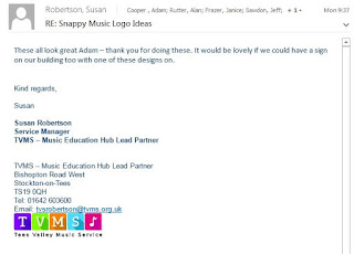
I received written feedback from Susan Robertson (TVMS Service Manager) crediting the above logo design:
 |
| Feedback from senior manager. |
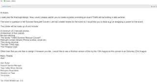
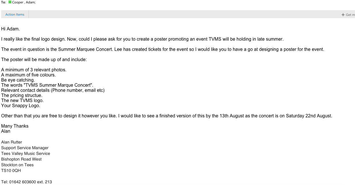
The 2nd part in my project was to design and produce a professional looking poster promoting a TVMS event.
Below is the brief that I was given from Alan:
 |
| Email 2: Feedback and Brief #2 received from Alan. |
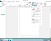
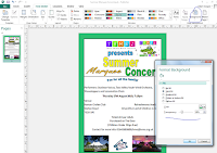
As you can see from the email, this task is a lot more difficult and a lot more tools are used than the logo task. Using Publisher, I opened a new A4 portrait document adding a border, fonts and relative information and appropriate photos onto the page.
 |
| 1) Using the Shape menu I was able to select the Rectangle tool. |
 |
| 2) Black border was created using Rectangle tool. |
 |
| 3) I have used Arial Black which is a standard font style. |
 |
| 4) I have colour corrected the font from black to green for one of the fonts. |
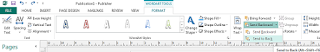 |
| 5) The feature above allows me to arrange layers in Publisher. |
 |
6) I have added the logo and fonts to the poster.
 |
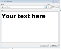
| 7) I warped the text using the tool shown above. |
 |
| 8) Warped text. |
|
|
|
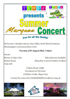
9) Relevant information (Performers, venue, price) has been added
to the poster. |
 |
10) I liaised with Alan and he said he wanted it to be more colourful so it would appeal to
the younger generation. I changed the border to green. |
 |
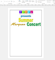
| 11) Finished poster design. |
The aim of this project was to fulfil the unit requirements while still completing the brief given by my employer. The brief for the poster stated it had to be eye catching which it is, use only five colours which I have, include relevant information and photos which it does. I have stuck to the requirements while also bringing something fresh and creative to the project. The reason I the fonts were colour corrected from black to blue, black to yellow and so on was to make them stand out. The event is also taking place in August so blue, yellow, orange and green are very bright summer colours. The images used are relevant to the event. Pictures of a marquee concert illustrates what the venue will look like. I made the date and time bold so it stood out from the white background and the rest of the text because this information is important for the reader. Aligning it in the centre of the page also helps with locating that information quickly.
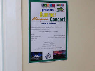 |
| This is what the poster looks like when printed. |
 |
It was stuck behind the reception desk so people can
read it when they enter the building. |
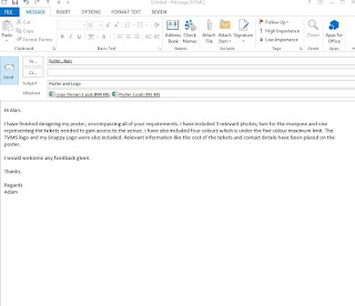 |
| Email 3: Sending Alan the final designs. |
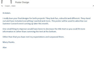 |
| Email 4: Overall feedback has been received from Alan. |
Finally, this unit has been challenging but interesting. I worked with design software to create the logo and poster, using many key skills requested from the unit brief I was given. The feedback I received from Alan was constructive, allowing me to progress and improve my designs further.


No comments:
Post a Comment